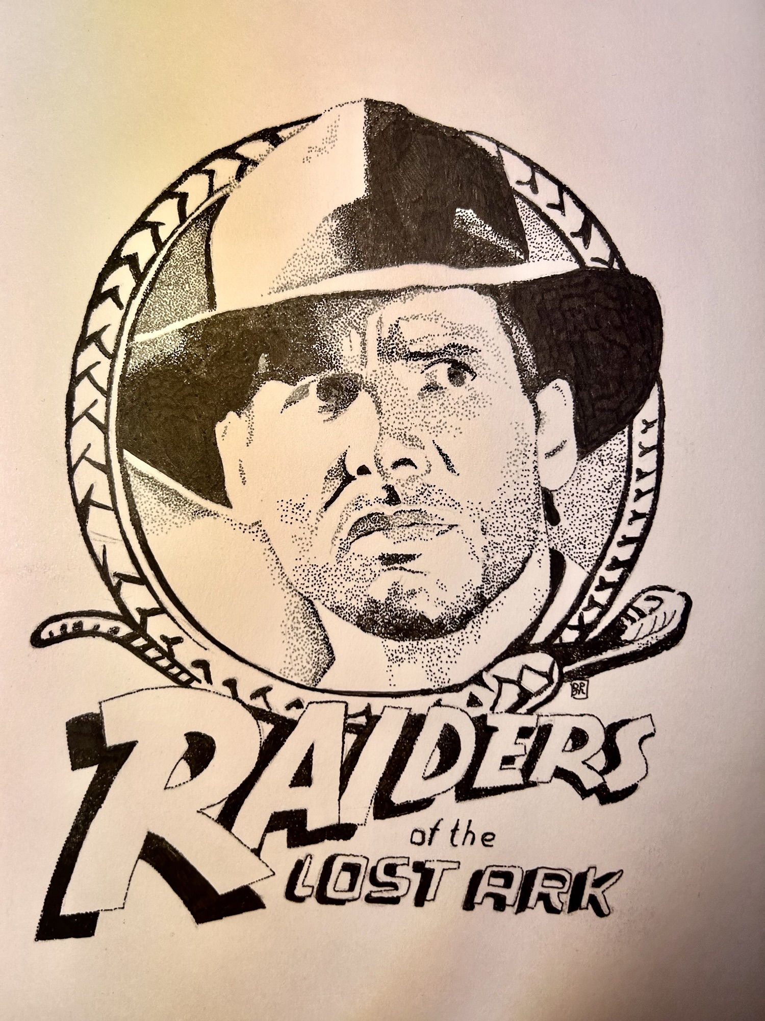
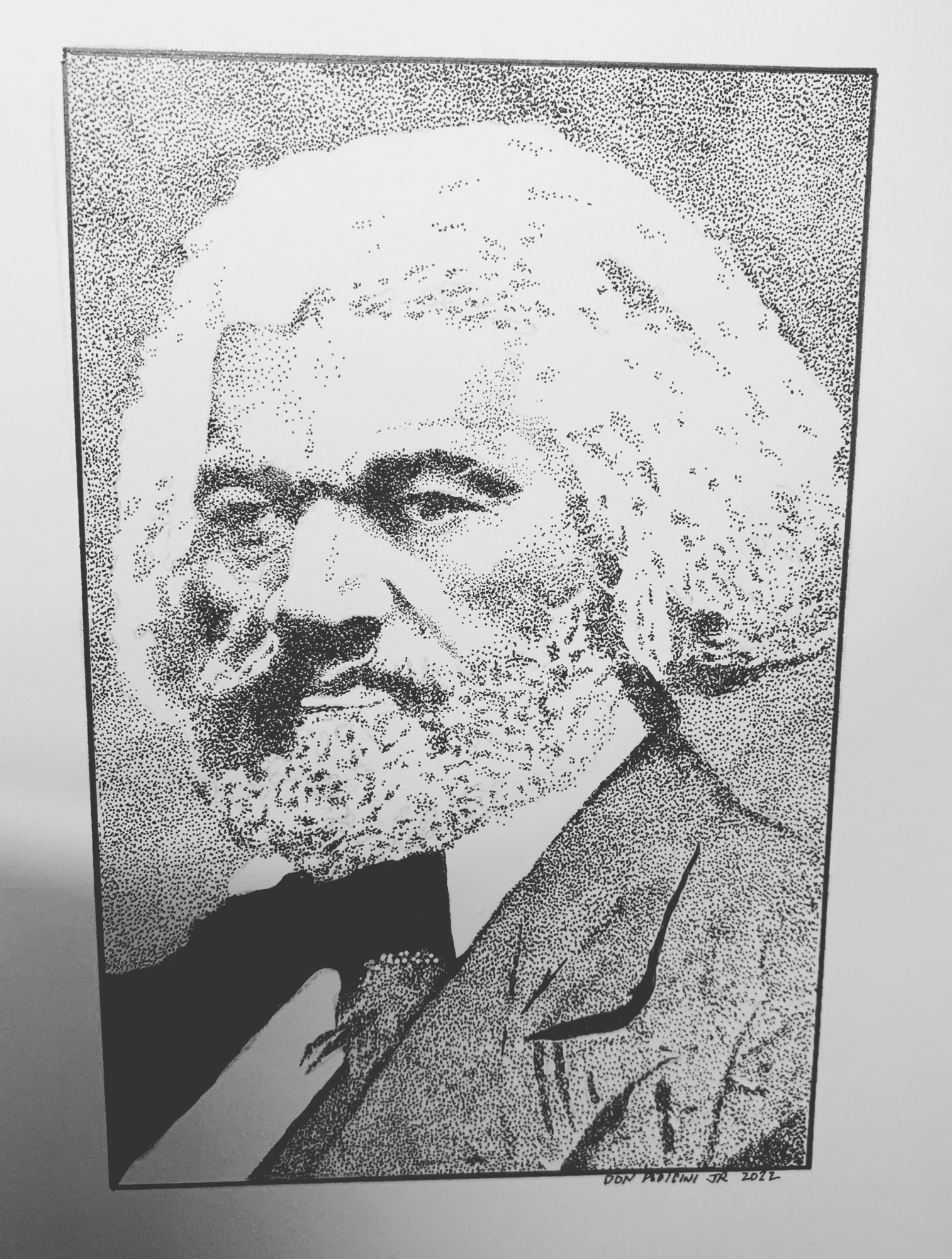
Stippling is one of the oldest and most meditative techniques in illustration — and one of my absolute favorites. Every mark is a single dot of ink. No lines, no shading in the traditional sense. Just thousands of tiny points of ink that, together, build light, shadow, form, and feeling. In this tutorial I’ll walk you through my complete process for creating a stipple portrait from scratch.
What You’ll Need
- Micron Pen 005 (for the finest dots and delicate highlight areas)
- Micron Pen 01 (for midtones and deeper shadows)
- Bristol board or smooth cardstock (ink bleeds on textured paper — avoid it)
- A printed or digital photo reference
- A lightbox or a bright window (optional but helpful for tracing the basic outline)
- Patience — stippling is slow, deliberate work, and that’s exactly the point
Step 1 — Choose and Prepare Your Reference Photo
Start with a high-contrast black-and-white reference. Color photos work too, but desaturating them first lets you read the light and shadow more clearly. Look for a photo with strong directional light — one side of the face noticeably brighter than the other. This contrast is what will give your portrait depth and dimension.
Print your reference at the size you intend to draw, or keep it open on a tablet beside you. Resist the urge to work from memory at this stage — accuracy in the early steps saves hours of frustration later.
Step 2 — Transfer the Basic Outline
Lightly sketch the major shapes onto your bristol board with a pencil — not the details, just the placement of the eyes, nose, mouth, hairline, and jawline. Keep the lines very light; they’ll be covered by ink, but you want as little graphite as possible under your stippling.
Alternatively, use the grid method: divide your reference into squares and replicate each square one at a time onto your paper. I use this technique regularly — it’s been standard practice for artists for hundreds of years and it works beautifully for achieving accuracy in portraits.
Step 3 — Identify Your Value Map
Before you place a single dot, study your reference and mentally divide it into zones:
- Highlights (the lightest areas — forehead catch light, tip of the nose, cheekbone) — these will have very few or no dots at all
- Midtones — a moderate, even spread of dots
- Shadows — dense clusters of dots, sometimes overlapping
This mental map is your roadmap. Stippling mistakes are almost impossible to fix, so thinking before dotting is essential.
Step 4 — Begin Stippling, Lightest Areas First
Always start with the lightest areas and work toward the darkest. Using your 005 Micron, begin placing dots in the midtone areas — evenly spaced, no touching, no dragging. Each dot should be a clean press-and-lift motion. Dragging the pen creates lines, not dots, and the effect is completely different.
In highlight areas, place dots very sparingly — even just a handful. The white of the paper does the work for you.
Key rule: density = darkness. The closer your dots are together, the darker that area reads from a distance. Step back from your work regularly to check how the values are reading.
Step 5 — Build the Shadows Gradually
Switch to your 01 Micron for the darker shadow regions. Layer dots over the areas you’ve already stippled, increasing density as you go deeper into shadow. Work in slow passes rather than immediately packing dots together — you can always add more, but you can’t remove ink.
For very deep shadows (under the chin, inside the ear, deep eye sockets), your dots may nearly touch or overlap. This is correct — it’s what creates that rich, velvety dark.
Step 6 — Tackle the Hair
Hair is the most tedious part of a stipple portrait — and, in my opinion, the most satisfying when it’s done well. Don’t try to draw individual strands. Instead, stipple the shadow between the strands, letting the paper represent the light catching the hair.
Work in the direction of hair growth. Build from the darkest roots and underside toward the lighter surface. For very dark hair, the dot density will be extremely high — but keep working in organized directional passes rather than random clusters.
Step 7 — Erase the Pencil Lines and Evaluate
Once your ink is fully dry (give it at least 15–20 minutes), gently erase any remaining pencil guidelines with a soft eraser. Then step back — ideally across the room — and evaluate the overall portrait.
Ask yourself: Do the light and dark areas read clearly? Does the face feel three-dimensional? Are any areas too flat or too dark? Make final adjustments, adding a few more dots where needed.
Step 8 — Sign It
You’ve earned it. Sign your work in the lower corner with your Micron 01.
Final Thoughts
Stippling rewards patience above all else. Your first portrait may take far longer than you expect — mine still do. But there’s a quality of attention in this technique that I find nowhere else. Every dot is a decision. And ten thousand good decisions, stacked together, become something remarkable.
Share your results in the comments below — I’d genuinely love to see what you create.
Don Pedicini Jr. is a professional illustrator who has created artwork for Topps, Cryptozoic Entertainment, Upper Deck, and many others. Commission your own stipple portrait →